Showing posts with label extra bold. Show all posts
Movie Show JNL


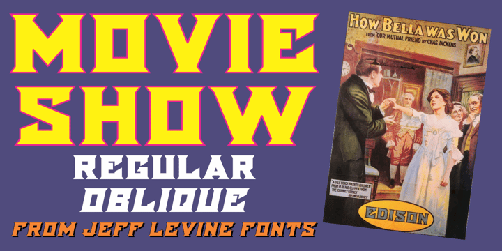
A 1911 movie poster for a film called “How Bella Was Won” from the Edison studios had the name “Edison” hand lettered in a bold, spurred sans serif design.


These few letters became the basis for Movie Show JNL, which is available in both regular and oblique versions.


Movie Show JNL


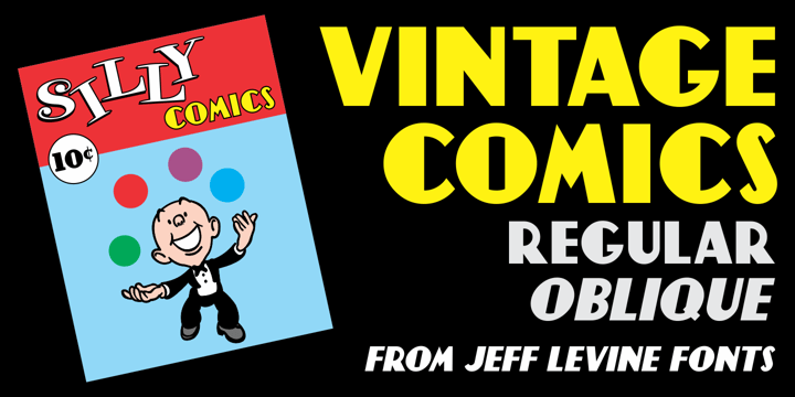
Vintage Comics JNL


Vintage Comics JNL was inspired by the way the word “comics” was hand lettered on many of the comic book covers of the 1940s, and is available in both regular and oblique versions.


Vintage Comics JNL


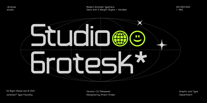
Studio Grotesk


Studio Grotesk is a modern sans typeface with a futuristic touch. This multi-purpose typeface will grab reader's attention with its stylish and neat design. With over 500+ Glyphs, five styles and a wide range of weights its a timeless workhorse for many possible application from branding to editorial.


Studio Grotesk


Download Manufacturer JNL Fonts Family From Jeff Levine


Manufacturer JNL is a reinterpretation of the classic type face Venus Extra Bold Extended, and is available in both regular and oblique versions.


According to Wikipedia:

“Venus or Venus-Grotesk is a sans-serif typeface family released by the Bauer Type Foundry of Frankfurt am Main, Germany from1907 onwards. Released in a large range of styles, including condensed and extended weights, it was very popular in the early-to-mid twentieth century. It was exported to other countries, notably the United States, where it was distributed by Bauer Alphabets Inc, the U.S. branch of the firm.”


Download Manufacturer JNL Fonts Family From Jeff Levine


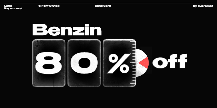
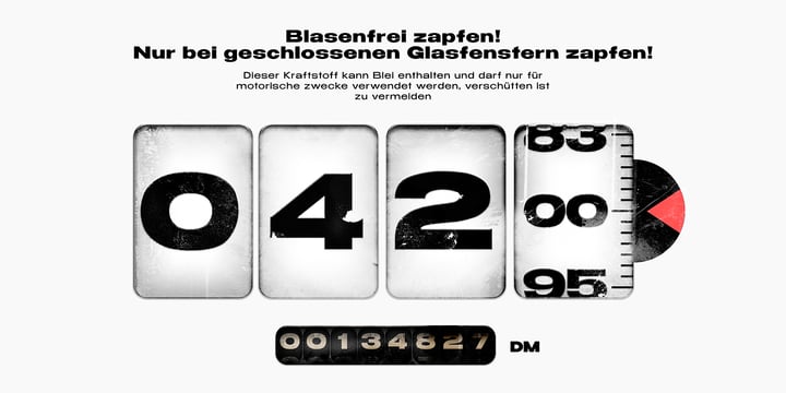
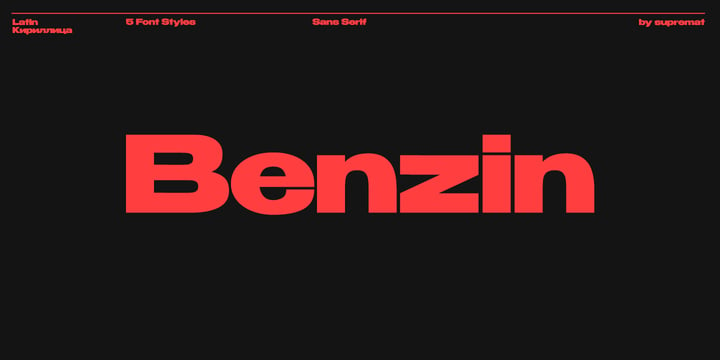
Download Benzin Fonts Family From Supremat
Download Benzin Fonts Family From Supremat Download Benzin Fonts Family From SuprematDownload Benzin Fonts Family From Supremat


Benzin is a geometric sans serif family that comes in 5 weights.

This is a universal font that can be used for both headings and paragraphs, thanks to the customized kerning for bold and thin style. In the thin style, the kerning is more sparse, in the bold style it is more dense. This allows you to immediately use a bold style in large headlines and posters, and a thin style in small texts and paragraphs. This is very convenient and you don't need to think about setting up kerning.


Download Benzin Fonts Family From SuprematDownload NowView Gallery