Showing posts with label Headline. Show all posts
Laophe
Laophe Font Family was designed by Satia Hayu Prabowo, Fitriyawan, and published by Runsell Type. Laophe contains 1 styles and family package options.

Download Now
Server 1
Download Now
Server 2
Download Now
Server 3


About Laophe Font Family Laophe font is perfect for many of your projects like logos & branding, photography, invitations, watermarks, advertisements, product designs, stationery, wedding designs, labels, product packaging, special events and much more.

Laophe
Laophe


Laophe


Hefring Slab Variable


Hefring Slab Variable is a modern Slab Serif. Based on simple geometry, it has minimal stroke contrast, solid serif presence and a uniform thickness of strokes. Inspired by the work of the renowned Margaret Vivienne Calvert, Hefring Slab Variable is robust, clear and functional. It supports Latin-based languages, available in Regular and Italic and allows you to create custom weights within the versatile width and weight parameters.


Hefring Slab Variable


Dancing Girl JNL


The poster for the 1930 film “Show Girl in Hollywood” had the title hand lettered in a squared Art Deco style with some angled cross strokes. This became the basis for Dancing Girl JNL, which is available in both regular and oblique versions.


Dancing Girl JNL


Village Hall JNL


A 1918 poster issued during World War I from the YWCA encouraged women to pitch in to the war effort by joining the “United War Work Campaign”.


The Art Nouveau hand lettering of that poster was a slight throwback to the “Western” or “Victorian” style of typography because of the characters having split serifs.


This is now available as Village Hall JNL, in both regular and oblique versions


Village Hall JNL


Privilege Sign JNL


The above-the-store signage for many newspaper stands, soda shops, candy stores, luncheonettes and pharmacies of the 1950s and early 1960s were what was referred to as “privilege signs” provided by one of the major cola brands.


Consisting of the brand’s emblems on the left and right, the remainder of the sign would carry the desired message of the storekeeper (such as “Candy – Soda – Newspapers”) in prismatic, embossed metal letters.


Inspired by these vintage signs, Privilege Sign JNL recreates the condensed sans serif lettering style in both regular and oblique versions. The typefaces are solid black, but adding a selected color and a prismatic effect from your favorite graphics program can reproduce the look and feel of those old businesses.


Privilege Sign JNL


Nouveau Meadow JNL


A poster for the publication “The Quartier Latin – A Magazine Devoted to the Arts” featured the magazine’s name in a light Art Nouveau serif style. The Quartier Latin was published between 1896 and 1899 by the American Art Association of Paris.


This is now available as Nouveau Meadow JNL in both regular and oblique versions.


Nouveau Meadow JNL


Foda Egypt


Foda Egypt is a sans-serif font family comes with 6 main weights and their italics, with 599 glyphs that support many languages and cover many OTF features such as accents, ligatures, kerning and more …

Foda Egypt is a stylish modern sans-serif suited for headlines, newspapers and many purposes thanks to the clean lines and sharp edges that render out so clearly on screens which increases legibility for all users.


Foda Egypt


Municipal Pool JNL


A photo of the now closed [circa-1953] Lowell Municipal Pool (at 1601 N. 28th St.) in Boise, Idaho shows the words “Municipal Pool” formed into the cement of the entrance to the above-ground swimming facility.


Both the lettering and building entrance designs harken back to the Art Deco era and the sign features stencil-like characters.


This inspired a typeface aptly named Municipal Pool JNL, and is available in both regular and oblique versions.


Municipal Pool JNL


On Your Mark JNL


Images of ‘lost’ or forgotten signs from the past are on a number of sites all over the web.


One in particular partially revealed a vintage sign for “J. Yormark Shoes" behind a barbershop sign at 15 – 8th Avenue in New York City. The sign remained until 2014.


The stencil effect made by the formation of the stained glass letters inspired On Your Mark JNL, which is available in both regular and oblique versions. The font’s name is a play on the shoe vendor’s name… “Yormark”.


On Your Mark JNL


Privilege Sign Two JNL


Unique and decorative signage for many drive-ins, motels, food stores and other businesses of the 1940s had what was referred to as “privilege signs” provided by one of the major cola brands.


Consisting of the brand’s emblem on a decorative panel, the remainder of the sign would carry the desired message of the storekeeper (such as “Drive-In”) in prismatic, embossed metal letters.


Inspired by the Art Deco sans serif style of those vintage signs, Privilege Sign Two JNL recreates the type design in both regular and oblique versions. The typefaces are solid black, but adding a selected color and a prismatic effect from your favorite graphics program can reproduce the look and feel of those old businesses.


This is a companion font to Privilege Sign JNL, which recreates the condensed sans serif lettering of other privilege signs from

the 1950s and early 1960s.


Privilege Sign Two JNL


Electric Newspaper JNL


Around 1931, the Los Angeles Times (in partnership with the Richfield Oil Company) installed on its building a moving message board similar to the one at the New York Times in New York City which they dubbed an “electric newspaper”.


The style of characters used on this electronic sign were the basis for the namesake font Electric Newspaper JNL, which is available in both regular and oblique versions.


A blank space to place between words is available on both the solid bar and broken bar keystrokes.


Electric Newspaper JNL


Office Staff JNL


Office Staff JNL is a version [with serifs added] of Popularity JNL – a condensed Art Deco design based (for the most part) on a popular typeface known in some foundry books as ‘Radiant’ with some reinterpreted characters… and is available in both regular and oblique versions.


Office Staff JNL


Dance Time JNL


The words “Benny Goodman & His Orchestra” on an appearance poster for the band from 1936 were rendered in a beautiful semi-script style of hand lettering.


Dance Time JNL


Foda Slab


Foda Slab is a powerful Arabic slab typeface that has two styles : Regular and Hollow.

With 886 glyphs Foda Slab has many ligatures which makes it suitable for headlines and other different graphic contexts.


Foda Slab


Rabento


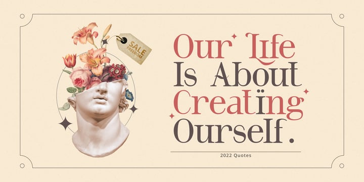
Rabento is an original serif family, with articulate and big letterforms.


The typeface was drawn and created by Mans Greback between the years 2018-2021, and is designed to assure a unique and confident character to any headline, logotype or title.


A display typeface made for large text displays, it is still clear and legible.


With great contrast, this lettering has precise hairline thin horizontal parts, a bold and expressive outline and fat slab serifs. It has traditional traits, but a new and modern design, which together makes for an impactful and notable type setting.


Rabento is provided in six high-quality styles:

Regular, Italic, Bold, Bold Italic, Black & Black Italic.


The font is built with advanced OpenType functionality and has a guaranteed top-notch quality, containing stylistic and contextual alternates, ligatures and more features; all to give you full control and customizability.

It has extensive lingual support, covering all Latin-based languages, from North Europe to South Africa, from America to South-East Asia.

It contains all characters and symbols you'll ever need, including all punctuation and numbers.


Rabento


Transit Station JNL


The thin and stylish Art Deco lettering of a neon sign above the Greyhound bus terminal entrance in a 1930s New York City photo inspired Transit Station JNL, which is available in both regular and oblique versions.


Transit Station JNL


Air Circus JNL


A 1930s advertising poster for the Inman Brothers Flying Circus offered up an interesting hand lettered Art Deco design that’s a cross between both squared and rounded character shapes. 


Because of it's 'futuristic look', the resulting type style can also lend itself to 1970s and 1980s retro projects as well as those from the 1930s and 1940s.


Now a digital font, Air Circus JNL is available in both regular and oblique versions.


A “Flying Circus” is a troupe of ‘barnstormers’ (stunt pilots) who performed aerial tricks either individually or as a team along with selling airplane rides to the general public. 


Air Circus JNL


Rail Travel JNL


Here’s yet another interpretation of the classic “thick and thin” sans serif lettering most popular during the Art Deco era.


This particular design comes to you through the courtesy of a hand lettered 1930s travel poster from the Pennsylvania Railroad. Some capitals are much wider than others, while the lower case ‘i’ is somewhat truncated.


Rail Travel JNL is available in both regular and oblique versions.


Rail Travel JNL


Headbears


Hello Everyone, introduce our new product Headbears - Sport Display, inspired by the title of the sports poster and We make it very energetically. Headbears font with strong and challenging nuances. very suitable for the title, typography, Poster, magazines, brochures, packaging,Websites and much more for your design needs, making your designs more modern and professional.


Headbears


Bill of Fare JNL


A 1942 menu cover for the restaurant at the Biltmore Hotel in Los Angeles features its name in a stylized Art Deco serif design.


This is has been turned into the digital typeface Bill of Fare JNL, and is available in both regular and oblique versions.


Bill of Fare JNL