Showing posts with label 1970s. Show all posts
Plinc Hasler Circus


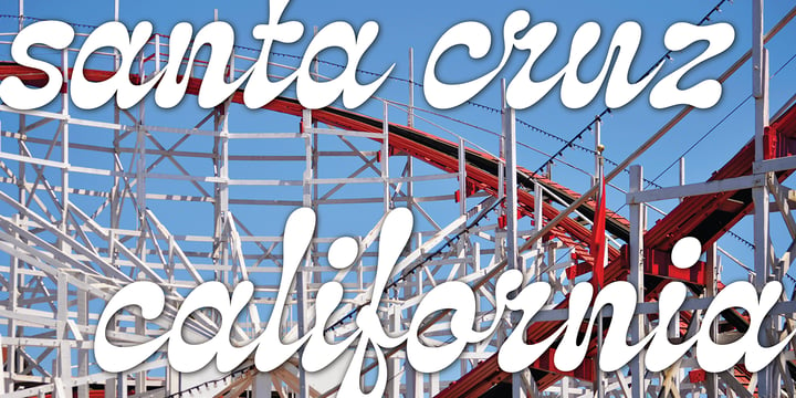
Hasler Circus packs amusement park, Old West, folk art, and tattoo shop all into one colorful font. Characteristic of reverse-contrast faces, Hasler Circus swaps the weight of its stems and serifs creating an unexpected yet charming rhythm. The font also features an added bonus: split stroke endings to crank up the flavor. Inject a dose of novelty into toy packaging, candy wrappers, cook books, vintage signs, or festival marketing. Drawn in the 1950s for Photo-Lettering, Inc. by influential British designer and typographer Charles Hasler, Circus was digitized by Erik van Blokland in 2011, with a helping hand from Ken Barber.

HASLER CIRCUS CREDITS:

Typeface Design: Charles Hasler

Typeface Digitization: Erik van Blokland, Ken Barber

Typeface Production: Ben Kiel


Like all good subversives, House Industries hides in plain sight while amplifying the look, feel and style of the world’s most interesting brands, products and people. Based in Delaware, visually influencing the world.


Plinc Hasler Circus


Girard


Whatever the medium, Girard’s love for typography was the common thread that wove his work together. We are honored that the Girard family has entrusted us to celebrate and expand upon the legacy of this design icon with this collection of fonts. The Girard Slab family gracefully synthesizes illustrative sensibilities into a practical typographic framework. Slab’s three widths and four weights ensure versatility in a modern editorial setting while its gentle curves transcend the sterility of traditional typography to add an unprecedented warmth and personality. From boutique chocolate packaging to the titling sequence for an indie vegan superhero cartoon, Girard Script deftly adds a contemporary sophistication to text and display settings. Inspired by a workhorse lettering style that helped Alexander Girard implement thousands of design elements in his overhaul of the Braniff identity system, Girard Sky pulls its weight in any contemporary application. In Girard Sansusie, each character stands alone as an illustrative element while coming together with its counterparts as a whimsical yet functional typeface.

FEATURES:

  • The ligatures feature substitutes specially-drawn letter combinations that combine two, three or even four characters to create smoother transitions and simulate lettering sensibilities.
  • Girard Slab’s three widths and four weights ensure versatility in a modern editorial setting while its gentle curves transcend the sterility of traditional typography to add an unprecedented warmth and personality.
  • Copious alternate characters and “smart” OpenType programming allow Sansusie to escape the rigid confines of typography to come alive as if flowing from Girard’s sketchpad. This animation shows a sampling of the swash characters available in the font.

GIRARD CREDITS:

  • Typeface Design: Alexander Girard, Ben Kiel, Ken Barber, Laura Meseguer
  • Typeface Production: Ben Kiel
  • Typeface Direction: Christian Schwartz, Andy Cruz, Ken Barber


Like all good subversives, House Industries hides in plain sight while amplifying the look, feel and style of the world’s most interesting brands, products and people. Based in Delaware, visually influencing the world.


Girard


Atwin


Atwin is a modern remake of Gemini, hence the name (Atwin = “A twin” = Gemini, the twin of the zodiac). It is inspired by the angular and unusual forms of the numbers on bank cheques (so-called MICR).

Large blobs of weight are thrown around the glyphs often in unfamiliar patterns. It makes for an angular but also blobby design that disrupts and breaks away from tradition.

You should use Atwin to add flair and confidence to sci-fi, futurist, outré, or just plain unusual materials. Good in displays sizes.

Latin-based scripts are well supported with a generous supply of punctuation and diacritics.

Kerned to perfection. Tight.


Atwin


Acid Green


Acid Green has quite a psychedelic flair, but its origins are from long before the sixties psychedelia.

Its roots date back to 1914, from an unnamed alphabet by J.M. Bergling, the amazing jewelry engraver and 'letterform inventor'—as he considered himself—whose books of art alphabets and lettering influenced countless artists, including, not surprisingly, those involved with the genesis of Art Nouveau and Art Deco movements.

Perfect for multiple display uses, including retro designs and trippy letterings, Acid Green has an extensive character set, with multilingual support covering 208 languages. There are yet some handy stylistic alternatives for some extra grooviness.

Acid Green is somewhat retro looking, for sure, but it can sound perfectly contemporary too. Tune in and enjoy a creative trip!


[Pizza illustration on the first graphic by our neighbor @pedrocorrea84]


Acid Green


Download Masantina Fonts Family From Estudio Calderon

Download Now
Server 1
Download Now
Server 2
Download Now
Server 3


A clean, elegant and modern serif that has a strong personality thanks to its soft endings, rounded terminals, inspired from Cheltenham, Belwe and Souvenir.


Masantina is equipped for complex, professional typography. The OpenType fonts have an extended character set to support Central and Eastern European as well as Western European languages. 


Download Masantina Fonts Family From Estudio Calderon


Download Masantina Fonts Family From Estudio Calderon


Download Klangfarbe Script Fonts Family From Mysterylab

Download Now
Server 1
Download Now
Server 2
Download Now
Server 3


Klangfarbe is a quirky ultramodern script with unique stroke tapers and droplet-like finials. This font is a true chameleon and is very much at home with a variety of looks: from a reimagining of kitschy 1950s scripts, to analog retro-tech, to steampunk, to high-fashion futuristic logos and beyond. Klangfarbe — a German language term meaning “timbre” or “sound color” — references the visual appearance of audio frequency waveforms echoed in many of the lowercase letters. A truly eye-catching choice.


Download Klangfarbe Script Fonts Family From Mysterylab


Download Klangfarbe Script Fonts Family From Mysterylab


Download Dismedia Fonts Family From Lee Mounsey


Dismedia: A Bold Display Typeface with a Subtle Retro Sci-Fi Aesthetic.


While a lot of futuristic, cyberpunk and techno themed typefaces can often be over-the-top, unreadable or cheesy, Dismedia takes a more subtle approach with its design. Inspired by the wide futurist fonts of the 1970’s and 80’s, its rounded corners and bold linework was built to invoke the atmosphere of a future envisioned by the past.


Whether on VHS covers in 1984; nightclub signs in 2084; or spaceship insignia in 2184, Dismedia will upgrade your design into a brand new era.


[ Feature Set Includes: ]


>      A Display Typeface

>      A Bold Sans Serif with Rounded Corners

>      430+ Glyphs

>      Ligatures & Stylistic Alternatives

>      Extended Mathematics & Currency Symbols

>      Language Support for 190+ Latin Languages Including: Afrikaans, English, French, Italian, Spanish & Swedish.


Download Dismedia Fonts Family From Lee Mounsey


Download Kaleidoscope Fonts Family From Mysterylab
Download Kaleidoscope Fonts Family From Mysterylab Download Kaleidoscope Fonts Family From MysterylabDownload Kaleidoscope Fonts Family From Mysterylab


Kaleidoscope is a groovy retro font with roots in the Art Nouveau movement and the psychedelic sixties. Works great for trippy band or festival posters, logos, invitations, and anything that needs a flowing funky vibe.


Download Kaleidoscope Fonts Family From MysterylabDownload NowView Gallery